Table of Contents
1. What is a Boxplot? #
- A boxplot shows the spread of data using quartiles.
- It highlights the median, the interquartile range (IQR), and any outliers.
- Unlike a histogram, it doesn’t show the shape in detail, but it’s excellent for quick comparison between groups.
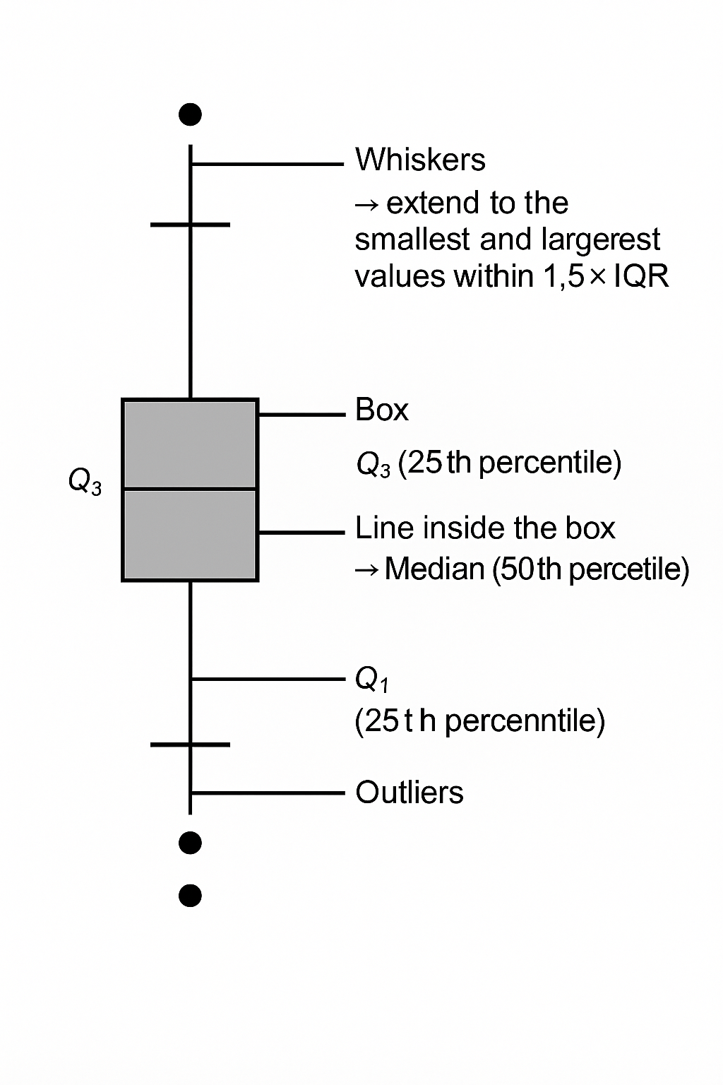
2. Structure of a Boxplot #
- Box → from Q1 (25th percentile) to Q3 (75th percentile).
- Line inside the box → Median (50th percentile).
- Whiskers → extend to the smallest and largest values within 1.5 × IQR.
- Outliers → points beyond the whiskers (plotted individually).
👉 Formula for IQR:
IQR=Q3−Q1
- Lower whisker = Q1 – 1.5×IQR
- Upper whisker = Q3 + 1.5×IQR
3. When to Use a Boxplot #
- To compare distributions (e.g., defect counts across shifts or suppliers).
- To detect outliers.
- To check for skewness (if median is off-center inside box).
4. Example Walkthrough #
Let’s use the delivery times data again:
[2, 3, 3, 4, 4, 4, 5, 6, 15]
- Median = 4
- Q1 = 3
- Q3 = 5
- IQR = 2
- Upper whisker = Q3 + 1.5×IQR = 5 + 3 = 8
- So the value 15 is an outlier (above whisker).
The boxplot will clearly show 15 as a separate dot.
👉 Would you like me to plot this boxplot for the delivery times dataset so you can see how outlier detection works visually?
Boxplot of Delivery Times #
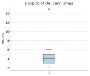
Here’s the boxplot of delivery times 📦
- The blue box spans from Q1 = 3 to Q3 = 5 (middle 50% of data).
- The red line inside is the median = 4.
- The whiskers stretch from 2 to 6 (within 1.5 × IQR).
- The dot at 15 is an outlier, shown separately.
This makes it super clear: most deliveries happen in the 3–5 minute range, but there’s one unusually long delivery (15 min).
✅ Key takeaway:
- Boxplots summarize center, spread, and outliers in one compact chart.
- They’re especially powerful for comparing multiple groups side by side (e.g., suppliers, shifts, machines).


