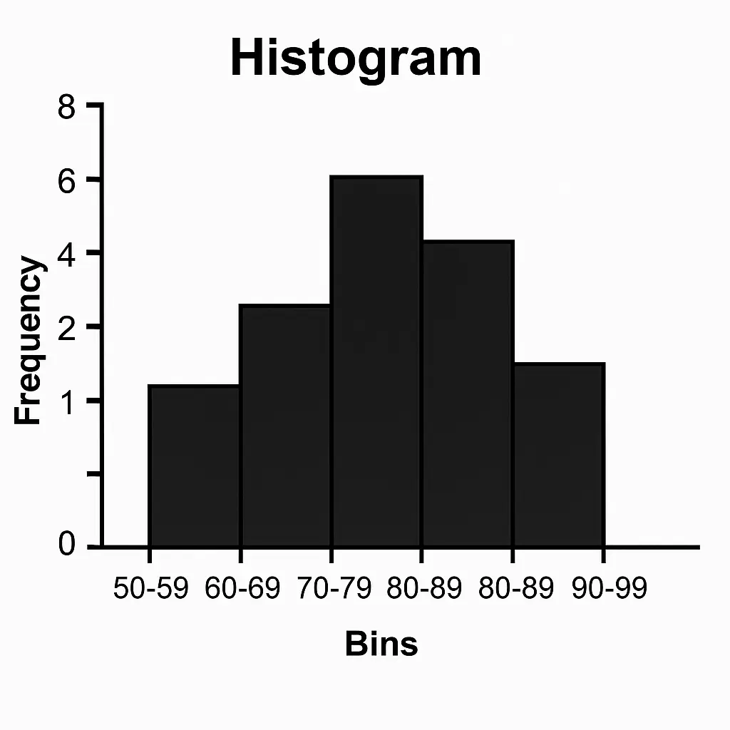
1. What is a Histogram? #
- A histogram is a graph that shows the distribution of numerical data.
- It looks like a bar chart, but instead of categories (like “apple, banana, orange”), the x-axis has intervals (called bins).
- Each bar’s height = frequency of data values within that bin.
Example:
If you record weights of 50 students and group them into ranges (50–55kg, 55–60kg, etc.), the histogram shows how many students fall in each range.
2. How is it Different from a Bar Chart? #
- Bar Chart: used for categorical data (defect type, car brand, etc.). Bars are separated.
- Histogram: used for numerical data (weight, production units, delivery times). Bars touch each other (continuous).
3. Key Features of a Histogram #
- Bins (intervals): Groups values (e.g., 10–20, 20–30). The choice of bin size can change how the data looks.
- Shape: tells you about the distribution of the data.
4. Common Histogram Shapes #
- Normal (bell-shaped) → symmetric, mean ≈ median ≈ mode
Example: human heights - Right-skewed (positively skewed) → long tail to the right
Example: income distribution (few very high incomes pull the mean up) - Left-skewed (negatively skewed) → long tail to the left
Example: age at retirement (most high, few low) - Bimodal → two peaks
Example: test scores if two groups of students perform differently - Uniform → flat, all values equally likely
5. Interpreting a Histogram #
- Center → Where most data falls (mean/median).
- Spread → How wide the data stretches.
- Shape → Normal, skewed, bimodal.
- Outliers → Bars far away from main cluster.
6. Advanced Use of Histograms #
- Overlay Normal Curve: Check if data follows a normal distribution.
- Kernel Density Estimation (KDE): Smooth version of histogram.
- Comparison Histograms: Compare distributions (before vs after process improvement).
📌 Let’s visualize different shapes with examples:
- Symmetric (production data)
- Right-skewed (delivery times with outlier)
- Bimodal (two peaks)
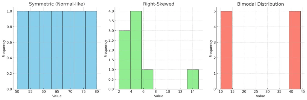
Here’s a side-by-side view of three histogram shapes 📊
- Symmetric (Normal-like) → Production data is evenly spread around the center. Mean ≈ Median.
- Right-Skewed → Delivery times: most values are low, but one big outlier (15) pulls the tail to the right. Mean > Median.
- Bimodal → Two distinct peaks (like two separate groups in the data).
👉 Histograms are super useful for detecting distribution shape, which later guides which statistical tests we should use.
Advanced Histogram Concepts #
1. Effect of Bin Size #
- The bin size (or number of bins) changes how the histogram looks.
- Too few bins → oversimplifies the data (hides patterns).
- Too many bins → overcomplicates (shows random noise).
Example:
Imagine measuring delivery times of 100 parts. If you make bins too wide, it may look like all deliveries are “normal.” If bins are too narrow, you might see artificial ups/downs.
👉 Rule of thumb:
- Sturges’ Rule: Bins=1+log2(n)\text{Bins} = 1 + \log_2(n)Bins=1+log2(n)
- Square-root choice: Bins=n\text{Bins} = \sqrt{n}Bins=n
- Freedman-Diaconis rule (advanced): Considers IQR (spread) of data
2. Density Histogram #
- Instead of raw counts (frequency), you scale the histogram so the area = 1.
- Useful when comparing two datasets of different sizes.
- Often used with Probability Density Functions (PDFs).
3. Overlay with Normal Curve #
- To check if data is approximately normally distributed, overlay a normal curve on top of histogram.
- This is often the first step in statistical modeling (many tests assume normality).
4. Comparative Histograms #
- Compare before vs after process improvement.
- Example: defect counts before a Six Sigma project vs after → two histograms side by side.
5. KDE (Kernel Density Estimation) #
- A smoothed version of a histogram.
- Instead of sharp bars, you get a continuous curve → better for visualizing distribution patterns.
📌 To make this concrete:
How about I show you the same dataset drawn as:
- Histogram with few bins
- Histogram with many bins
- Histogram with a normal curve overlay
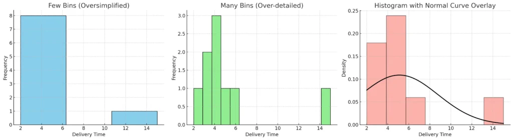
Here’s how the same dataset looks under different histogram settings 📊
- Few bins (Oversimplified):
- Just 3 wide bars → hides details.
- Looks like deliveries are evenly spread, but that’s misleading.
- Many bins (Over-detailed):
- 15 very narrow bins → too much noise.
- Hard to see the real trend.
- Normal curve overlay:
- Histogram shows the actual frequencies.
- Black curve is the normal distribution fitted using mean & SD.
- Notice the curve doesn’t perfectly match → because the dataset is right-skewed due to the outlier (15).
👉 This demonstrates why bin choice and curve overlays are critical in interpreting data distributions.


